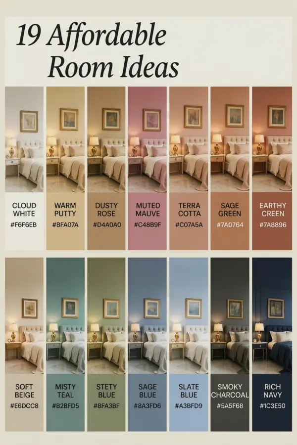
Last spring I painted my bedroom a deep terracotta and spent the whole weekend convincing myself it looked cozy. It didn’t. It looked like a pizza oven. But then I repainted three walls a soft off-white and left only the alcove behind my bed in that brick-like shade, and suddenly the room worked. That’s when I realized that most budget-friendly color ideas for bedroom are actually about restraint, not about color. You pick one wall, go soft on the rest, and the whole place feels like a hotel for under $50.
Budget friendly accent wall: why it works
Painting a single accent wall is the cheapest way to test a bold shade without committing to an entire room. A gallon of decent paint costs $30 to $50, and for a standard bedroom wall you’ll use maybe half of it. You can even buy a sample pot for eight bucks and paint a small section behind your headboard.
The trick is choosing the right wall. The wall you see first when you walk in, or the one behind your bed, works best. Don’t pick the wall with the window because the light will wash out the color. Also, please learn from my mistake: don’t paint a closet door the same shade unless you enjoy looking at a giant colored rectangle.
I used the leftover paint to touch up a thrifted nightstand that still carries a faint smell of the previous owner’s cigarettes. Now it just smells like paint, which is a genuine improvement.
Here’s a quick math check for your budget:
– Sample pots cover around 30 square feet, perfect for a small accent section.
– One gallon covers up to 400 square feet, more than enough for one wall.
– Primer and painter’s tape cost extra, but you can skip primer if your wall is already neutral.
– Paintbrushes and a roller can be reused, so that’s a one-time cost.
Soft neutral base colors that make everything look expensive
Your accent wall gets all the attention, but the other walls are doing the heavy lifting. If they look dull or chalky, the whole room goes flat. My favorite neutral isn’t white, it’s a greige with a tiny bit of green in it. It sounds weird, but it makes the bright colors around it feel softer.
Another neutral I keep going back to is a warm cream with a yellow undertone. It’s not yellow enough to read as yellow, but it gives the room a sunlight glow that plain white never does. Stay away from cool gray bases unless you want your bedroom to feel like a conference room.
For paint colors specifically, always test the neutral with your accent color. Tape two swatches on the wall, one for the accent and one for the neutral, then look at them at different times of day. What looks fine at noon can look dead at night.
Calm and sleepy color palettes that actually work
For a bedroom, calm doesn’t have to mean beige. Here are a few palettes I’ve seen work in real cheap room makeovers.
Sage green and cream. I did this in a rental and the landlord asked if I hired a designer. Use a real sage, not a mint. That one bit makes all the difference. Pair it with old wood furniture and you get an organic modern look for almost nothing.
Dusty blue and warm white. The blue should be a little gray, never too saturated. It reads like a cloudy morning. Add one navy pillow and it feels grounded instead of babyish.
Lavender and oat. Pale lavender with a warm oat or beige makes a room feel spacious and quiet. It’s not
Leave a Comment