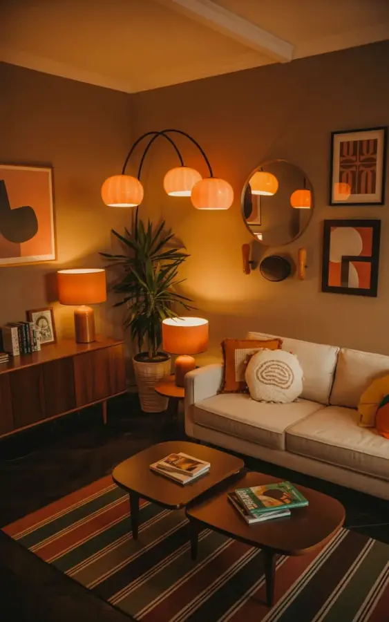
There’s a lamp in this photo with two orange glass globes that are basically little sunsets, and it does something a standard floor lamp can’t: it makes the whole room feel like it’s exhaling. That’s the heart of retro living room styling, and it starts with choosing warmth over bright light. When you walk into a space like this, you don’t notice the furniture first. You notice the glow, and then the dark wood credenza, and the cream sofa, and suddenly you’re already making plans to sit down with a drink.
Why warm lighting changes everything in a retro living room
Honestly, the orange globes in that lamp are doing the heavy lifting. They cast a soft, honey-colored glow that makes a dark wall feel like a blanket instead of a hole. Swap one bright overhead light for a warm arc lamp and you’ll see what I mean. That’s not a metaphor. I did this in my own apartment and my cat started sleeping in the corner near the lamp instead of hiding under the bed.
The trick is to place the lamp where it reaches the neutral areas. In the photo, the cream sofa catches the glow, and the dark credenza absorbs some of it. That balance is everything. If you make every light orange, it can feel like a Halloween theme. Just one warm source does the job.
Orange and brown decor without it looking like a pumpkin patch
People get scared of orange and brown because they picture autumn candles and burlap wreaths. Here’s the thing: the palette works when you keep the base neutral. The dark wall is almost charcoal with a brown undertone. The sofa is cream. Then the orange comes in as the sunset accent, not the whole show.
Brown appears in the wood of the credenza and the legs, in the frames of the art, in the shade of the mirror. It’s a grounding color, not a boring one. I used to avoid brown because every brown sofa from the 70s felt like a trap. But the trick is to pick wood with visible grain and pair it with light textiles. That way it reads as intentional, not inherited.
Mixing vintage art with a neutral sofa for midcentury modern comfort
Look at the wall in the photo. You’ve got a circular mirror, a geometric line drawing, an abstract shape with curves, and a small framed piece. None of them match, but they all share the same warm color family. That’s the midcentury modern approach to art: it’s about shape and tone, not about having one famous print.
A neutral sofa is your best friend here. It lets the art and the lighting do the talking. If you already own a gray or beige couch, you’re halfway there. Add throw pillows with texture, one white, one beige, maybe one with a subtle checkerboard pattern, and suddenly it looks like you planned it all along.
The beautiful part is that this look doesn’t require buying a bunch of new art. Hit a thrift store and grab anything with a curved line or a warm tone. If it’s an oil painting of fruit in a gilded frame, that can work too, as long as the colors match the room. I once hung a needlepoint of a fish because it had the exact same burnt orange as my lamp, and it became a conversation piece.
Leave a Comment